Case study: KENTI, Donate with confidence
Problem Statement
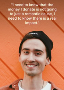
"People who want to donate - and according to the Fundación Española de Fundraising, 60% of Spanish citizens have contributed to a charitable cause at some point - tend to feel distrust towards some NGOs, which stops them from donating as much as they would like.
At the same time, NGOs operate according to official transparency laws and have been sharing accreditation of transparency badges for a while, in an attempt to give users more peace of mind.
So why does this distrust continue to exist? And, above all, what can be done to solve this disconnection?"

The project


Tools used in each phase of the Design Thinking process

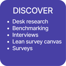


Research
For the reasearch phase I used the following tools:
Desk research
Competitive analysis / benchmarking
Lean survey canvas.
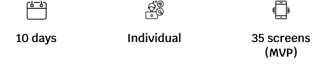
107 surveys
10 interviews
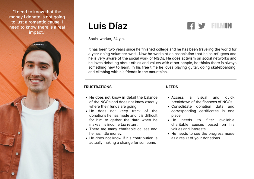
My conclusions were that although 80% of users consider the work of NGOs very important, 34% of them still hold distrust concerns and the main one is knowing exactly how will their money be used.
Users also lack knowledge of the bureaucracy and legality involved in deducting the donations on their income tax returns.
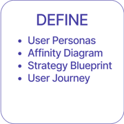
Definition
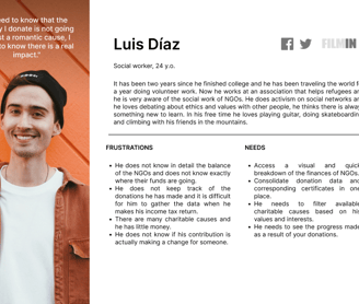
Users
I identified the following user type:
Device definition
At this point, I also made the decision, based on my research, that an app would be more adequate than a website, as I wanted to convey closeness and ease to users, and an app is ultimately at their fingertips.
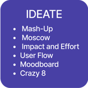
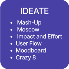
Ideation
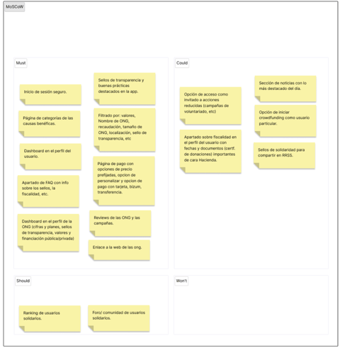
In order to prepare myself for the ideation process, I first created a MoSCoW chart that served as a first filter to prioritize the most essential items for the app.
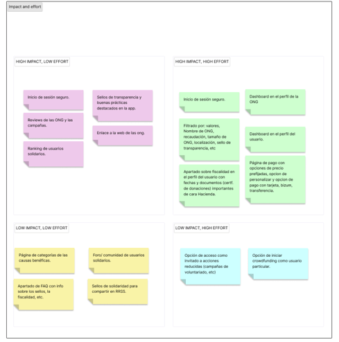
Then I eveloped an impact and effort chart to test the priorities based on the cost-benefit of each element, and afterwards I organized the elements that I would include in the developing app.
At this point I began to ideate making a mash-up, from which I got a lot of crazy ideas and some viable ones which were in line with the product. Such as a forum for communicating with other donors and with the NGOs themselves. After sketching on a crazy-8, I began to visualize the future app.
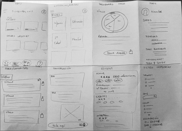
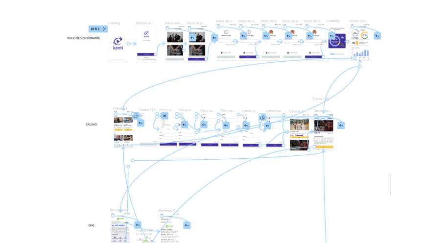
Wireframing
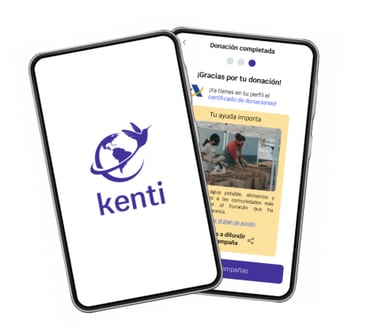
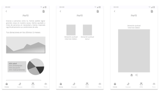
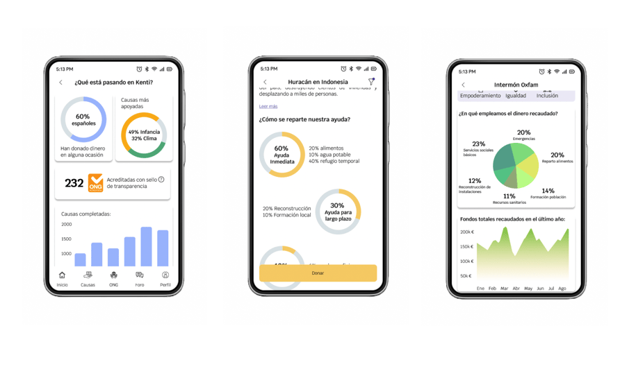
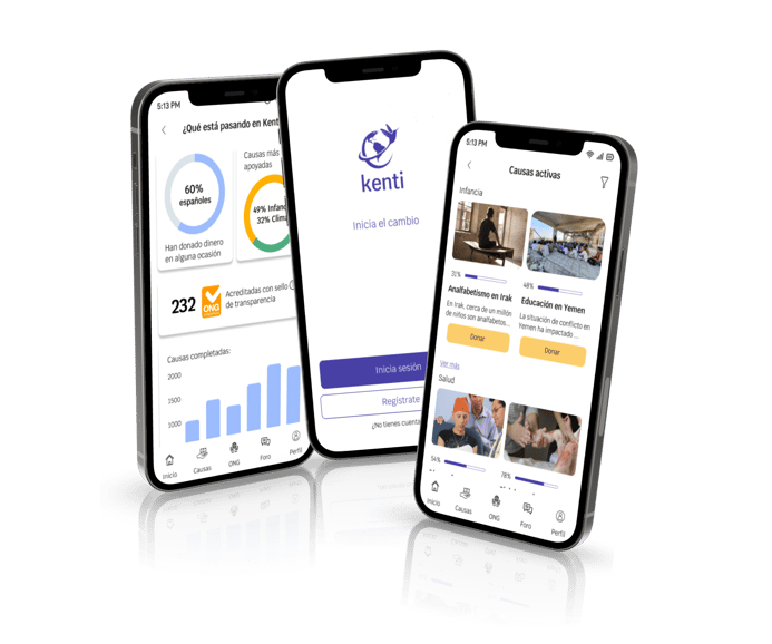
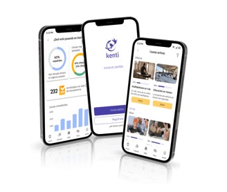
One of the most important things, according to my previous analysis, was to include data in a very visual way. Although NGOs actually have a transparency tab on their websites, they are not usually comfortable to navigate for the use. For example, in order to access the data the user must download pdf files - and in many cases they are very lenghty and with a significant predominance of text over visuals-.
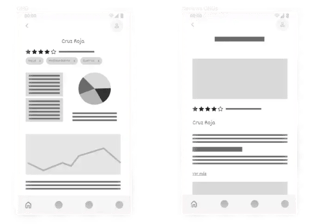
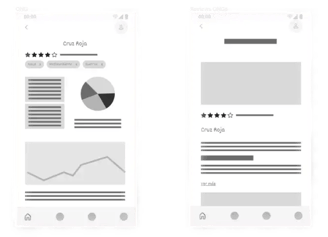
My decision was to include several dashboards:
On the home page with more generic data about the app itself (completed campaigns) or the NGOs (annual fundraising)
In the user profile to show the impact of their donations in the assisted communities.
In the profile of each NGO, to collect its values, specific financial data, etc.
One of the difficulties I encountered was that my app would need several user flows (one for donors and another for NGOs). However, given the time limited nature of the bootcamp, I decided to focus on the user flow of the donor.
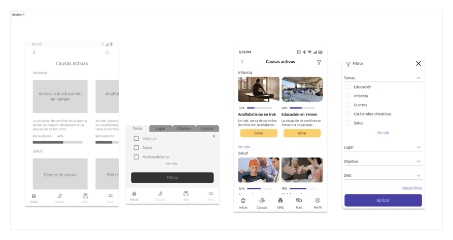
Another functionality that seemed essential to me was to include a filter for the user to find the causes to donate according to their interests (such as: places, NGOs, topic, etc).
And finally, I decided to include a feature to group the donation certificate in the user profile and thus, facilitate their presentation at the tax office.
I made some low fidelity wireframes and got them tested them by some users, who indicated that tabs on the filters were difficult to click on, but otherwise the interface seemed easy to use and intuitive.
I then designed mid-fidelity wireframes adding the suggested changes and defining the content of each screen.

The mid-fi testing confirmed that the filter I had proposed definitely did not work, it was confusing for most users and it was also too small to be clicked on comfortably. Therefore, I decided to swap it for a new version which deployed from the side for the High-fidelity prototype.

Branding
The chosen typography was Krub, which is a sans serif rounded font but with a similar style to Calibri, it's elegant yet friendly, and it encompasses the values I wanted to convey.
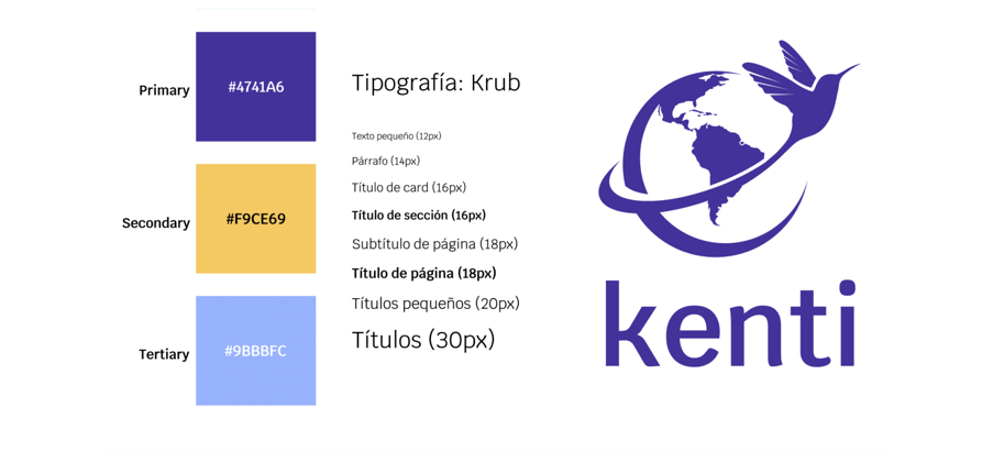
On choosing the brand colors I wanted to use some shades of blue to convey trust and transparency, and a warm color to convey closeness and humanity.
The idea for the logo and name came from the Guarani legend of the “hummingbird and the fire” which states that the most important thing in a moment of crisis is to do something, whatever is in your power, rather than just sit aside and watch the forest burn. And it seemed relatable for an app of charitable donations.
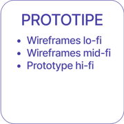
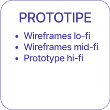
Prototyping
Finally I designed a high-definition prototype for which I needed great attention to detail and also a lot of iteration on the ideas I had (both UX and UI).
One of my challenges was creating several dashboards as I needed to put a wide amount of data within very little space, so I had to prioritize the most relevant and impactful data. I distributed the information along the dashboards, for example, I would include the annual fundraising figures on the home page and in the NGO's profile I would place the budgets for each charity topic, etc.
I also investigated how to make payments using Bizum, because:
It is a much more agile and comfortable payment method than a credit card.
It involves fever inputs to fill out.
Only a phone number is required, not any banking information, which reassures users who are suspicious of sharing that type of information
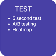
Testing
The testing of the application was successful overall with non-critical errors. All the people who did it managed to complete the task, although sometimes changing the path.
For example, instead of filtering to find the Hurricane donation in Indonesia, some people scrolled and looked for the donation card straight away.
Some screens were more challenging and took longer for the users than others, which tells me that some of the future iterations will be focused on these elements.
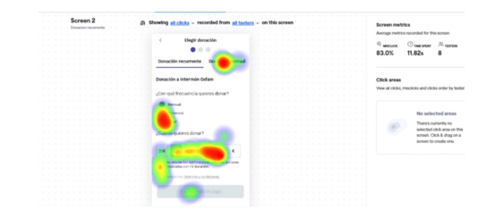
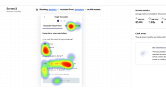
A very clear example happened when I made a heatmap on Maze, the average time spent on each screen was 4.5s, however on the screen where they had to choose between a recurring donation or a one-time donation, they took an average of 11.82s.
Thanks to this I changed the interface making the tabs more visible. Unfortunately, due to the short delivery deadlines, I couldn't measure this last change.
Next steps
In the future I would like to design the NGO user flow to start a campaign or check the progress of the fundraising events.
I also would like to facilitate a guest access so that users can navigate the application and see the campaigns and NGO data before deciding to register. I believe that would foster the use of the app by users who still distrust NGOs.
Of course, I’ll develop the user profile screens from the low-fidelity wireframes to the high fidelity design.
I would also like to implement an extra feature to access a forum where users can communicate with other donors.
Future metrics
I believe it is crucial to evaluate the effectiveness of the app design by tracking specific metrics such as the conversion rate of donations made through the app, the number of users who view the NGO's profile and ultimately donate, and the duration of time it takes for users to make a donation decision.
Learning
I would like to highlight two big challenges in this project: the dashboard screens and generating trust.
To this end, I spent a lot of time looking for inspiration and trying different options, I also did more testing than I’d done in previous projects, as I needed to know if my ideas worked out.
For the choice of branding, I resorted to the psychology of color, as it was very important to generate transparency ans trust, therefore the data should be very visible and the interface be easy to use.