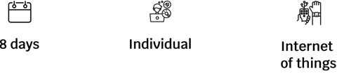
Case Study: Angelapp, Stopping Gender Violence
Enough is enough
If you’re a woman and you have ever felt scared walking alone on the streets, raise your hand.
Yes, me too, and statistics support this fear, according to a survey conducted by the Spanish Ministry of Equality, 57.3% of women residents in Spain over the age of 16 have suffered some form of sexist violence throughout their lives.
In addition, in recent months chemical submission attacks have increased, mostly at night clubs causing panic in those places which were meant to be joyful and fun.
Can technology help us address this problem?

The project

Tools used in each phase of the Design Thinking process


Problem statement
Women need to know that in the case of suffering gender violence or an attempted sexual assault, they will be protected. And the event the aggression is perpetrated, they need to be reassured they will be urgently attended to (by security forces and medical personnel) and their preferred emergency contacts will be notified automatically.
Research
For the reasearch phase I used the following tools:
Desk research
Competitive analysis / benchmarking
Lean survey canvas.
67 surveys
6 interviews
Benchmark
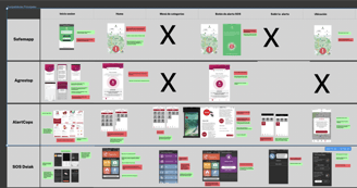
After that, I did a benchmarking analysis in which I compared the interfaces and functionalites of various anti-violence applications (such as Safemap, Agrestop, Alertcops or SOS Deiak) and some websites which included some elements that I found interesting (such as Waze and the playful and varied icons used to signal different types of users on the map).
Desk research
First, I did a desk research in which I discovered some relevant data such as:
72% of sexual assaults committed in 2021 were carried out through chemical submission.
Several wearables have already been designed to detect changes in vital signs which can help to protect people from attacks by detecting their emotional changes and tracking their location.
Applications such as the Guardian Verisure by Securitas Direct also do this, accompanying the person with their location and, in the event of a loss of mobile connection, sends the last location to emergency services to locate them.
Interviews and surveys
Finally, I got in touch with potential users to find out their needs and listen to their first-hand experiences:
I interviewed 6 people (half of them victims of gender violence or sexual assault and the other half, professionals who assist them).
With the information I collected in the interviews and the information I discovered I had been missing, I made a Lean Survey Canvas.
Having that in mind, I wrote the questions for a survey that 63 people responded to.
I was struck by how only 23% of the victims of a sexual harassment or aggression had asked for help from a friend or acquaintance, while 53% of respondents said they had helped a friend in the face of an attack. From this, I deduced how important third parties are in preventing and protecting against an attack.
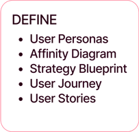
Definition
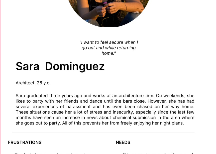
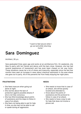
Users
I identified the following user type:
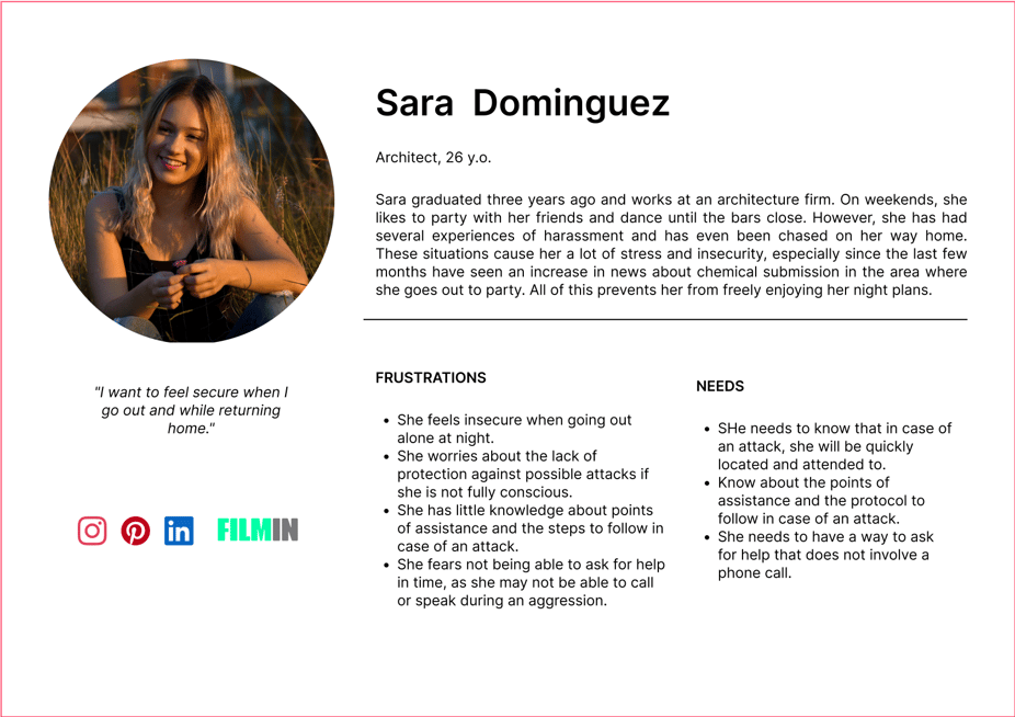
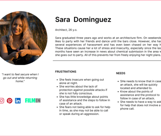
Based on Sara's concerns, I defined a uaser journey with everything that could happen to her during a night out while being harassed.
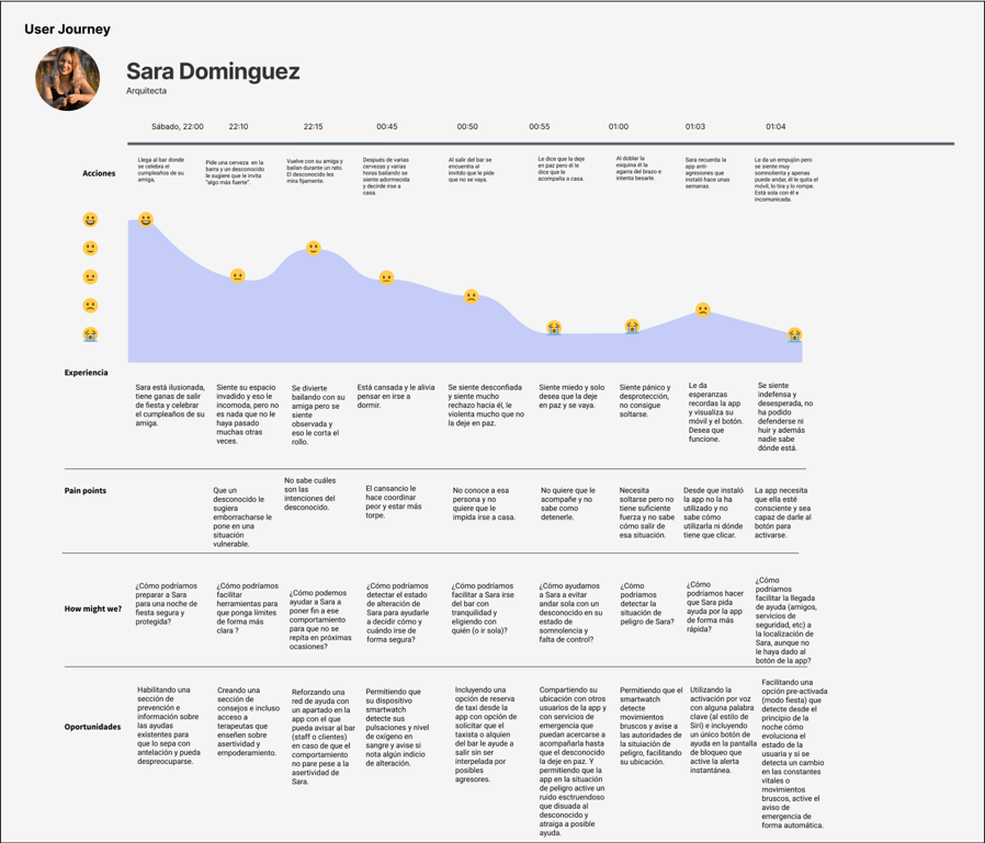
Through the user journey, I detected potential weaknesses in my initial proposals for the application and came up with possible solutions (how might we...? ) that I incorporated in future steps, for example, a voice activation option of the temporary alert.
I also created:
An empathy map to better understand the thoughts and concerns of the user
A Blueprint Strategy to define my design strategy
An affinity diagram to organize all the information and begin ideation with the clarity of real data that would help me better assist the users.
Ideation
I included some elements inspired by other apps such as Waze (the icons of the different elements of the map), Alertcops (the SOS button), Calm (meditations), etc.
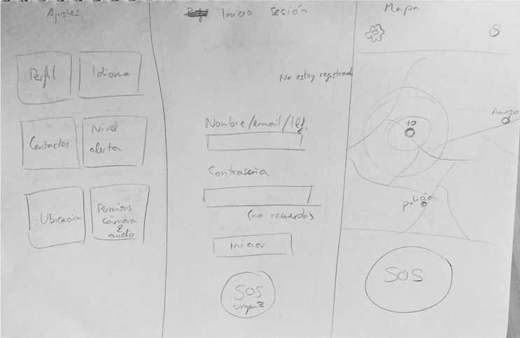
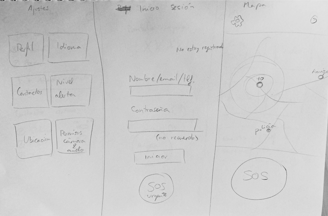
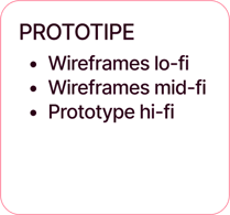
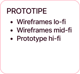
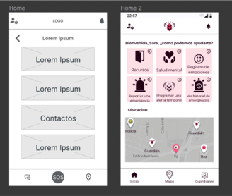
Wireframing
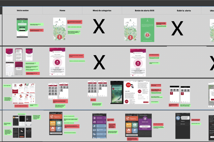
I designed the low-fidelity wireframes and tested them with three people, who suggested improvements such as freeing up space on the home by adding the contacts icon in the navbar, instead of using a card for this.
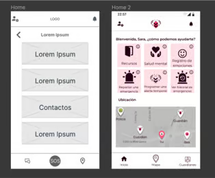
I made this and other improvements when designing the mid-fi wireframes and tested them with 4 people. They all agreed it was very easy and useful.
The main confusion point was the navbar icons because they were all filled and it lead them to think they were all active icons.

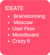
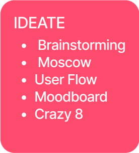
I then conducted a brainstorming and MoSCoW analysis in which I defined the most important features the application should have and how to include them in the interface.
I also made a Crazy 8 as a first sketch of the interface , from which I concluded my biggest challenge was making the app intuitive and accessible at the same time as discreet.
Discretion was crucial since some professionals told me that often when asking for help, the aggressor is nearby controling the victim.
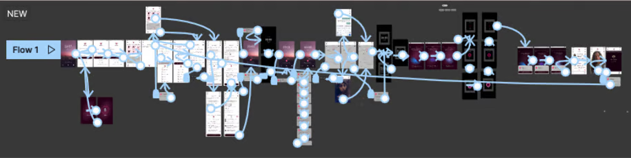
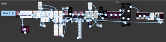
User Flow
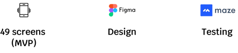
I developed a user flow that helped me clarify step by step a complete journey through both the App and the Smartwatch and also calculated the approximate number of screens that I would design later.

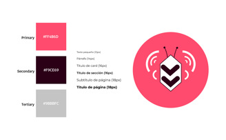
Branding
Regarding the app's identity, I had a clear idea that it had to revolve around the idea of protecting women, so:
I chose the name AngelApp, as "call Angela" or “Angel shot” is a code used worldwide to alert against gender violence.
The logo is inspired by a bee, as bees usually avoid stinging -because they die when doing so - but if one bee feels attacked, it quickly passes the word and the entire hive comes to its aid.
As for he main colors, I got inpiration from a moodboard with images of calm, protection and female empowerment.
Prototyping
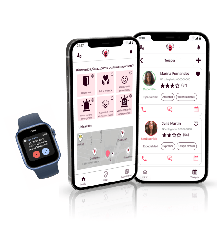
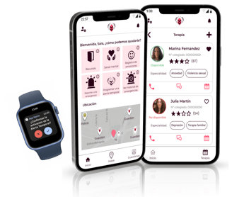
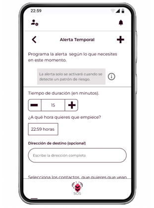
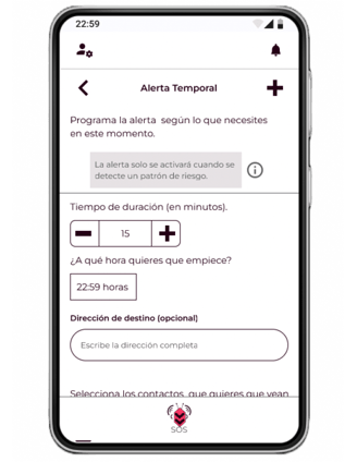
One of the main goals of AngelApp was to simplify the process of seeking assistance during emergency situations.
To achieve this, I introduced a feature called "Temporary Alert" which can be accessed from the home screen. This feature allows the user to schedule the start time, duration, and recipients of the alert, as well as to choose between:
automatic activation based on parameters detected by the smartwatch.
activation through voice commands using the keyword "Angela".
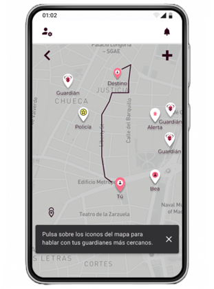
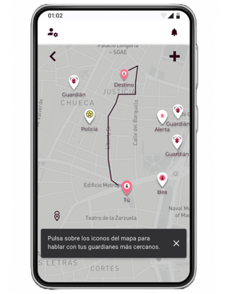
In addition to the Temporary Alert feature, AngelApp also includes a map that displays the user's current location, destination, and the nearest contacts and emergency services. The user can directly communicate with these contacts and services via call or messages.
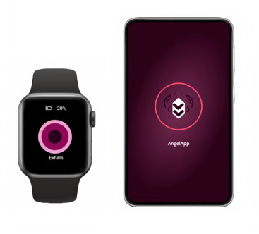
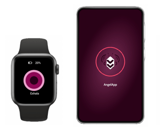
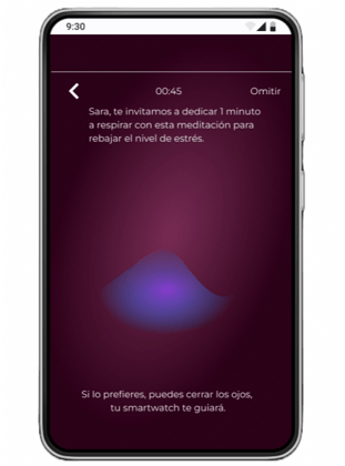
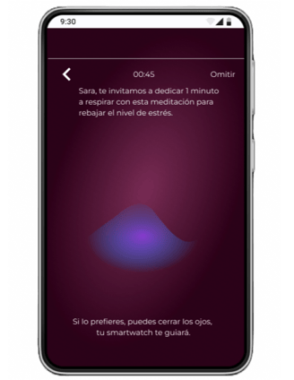
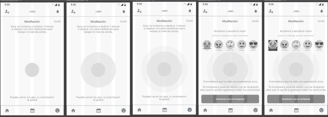
Once the alert is over, the app provides the user with an option to meditate, which can be synced with the smartwatch to guide the user through the process using vibrations. Once the user feels more calm, they can also choose to contact or schedule an appointment with a therapist for further support.
Finnally, I created a high-fidelity prototype incorporating all the improvements identified through previous user testing.
Testing and learning
The overall response to the app has been positive, with tested users finding it user-friendly. However, there are areas for improvement such as the redesign of icons for better clarity and functionality, as well as a thorough revision of certain features like the map, as users reported difficulty in finding the option to communicate with others.
Next steps
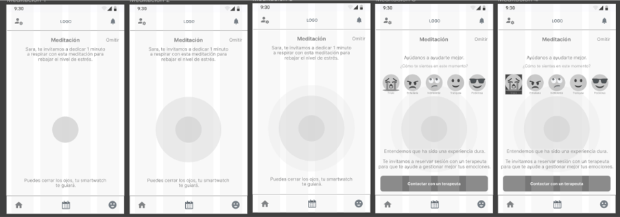
In the future, I will design and activate the emotion registration screens which are aimed to raise awareness of a possible case of gender violence (at this moment I’ve only designed it as mid-fidelity wireframes).
I would also like to improve the accessibility of the Resources section by making it simpler for users to access therapy providers and assistance centers from the home screen.